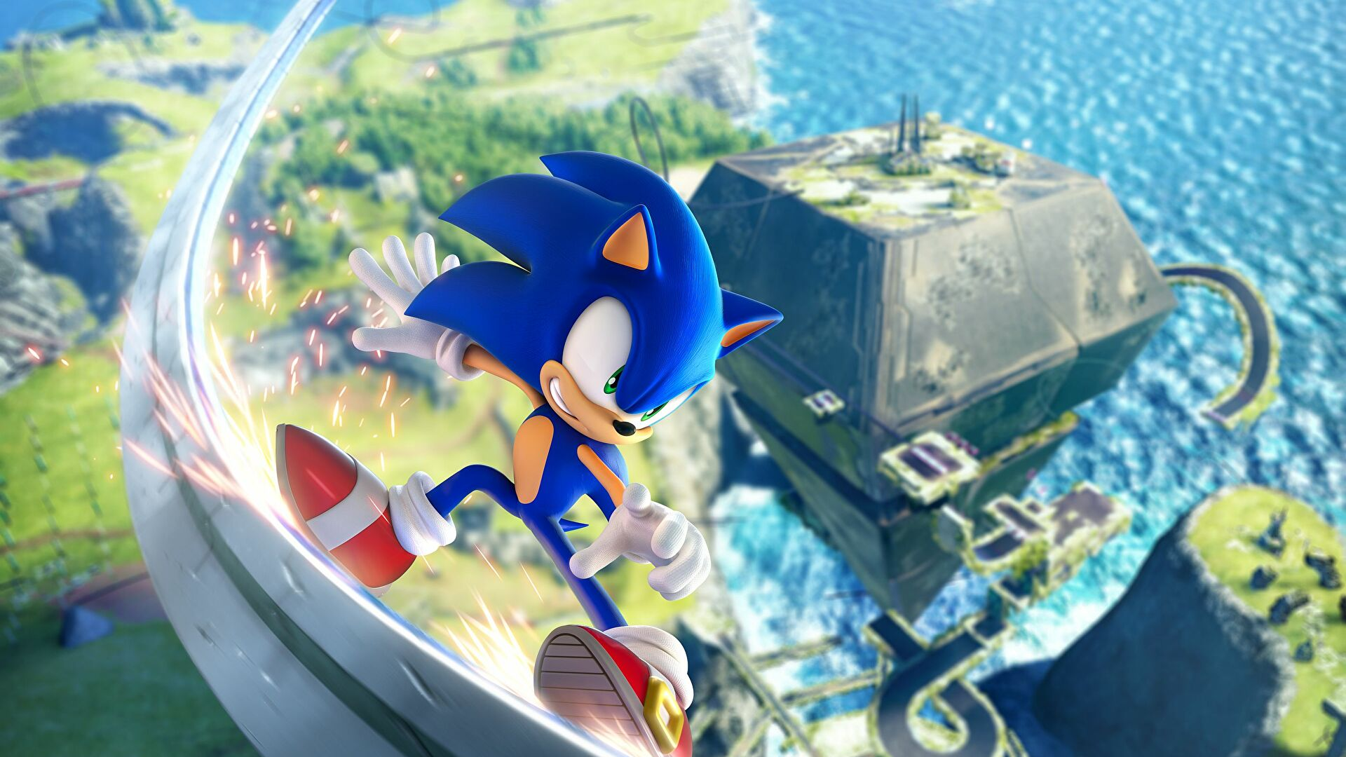
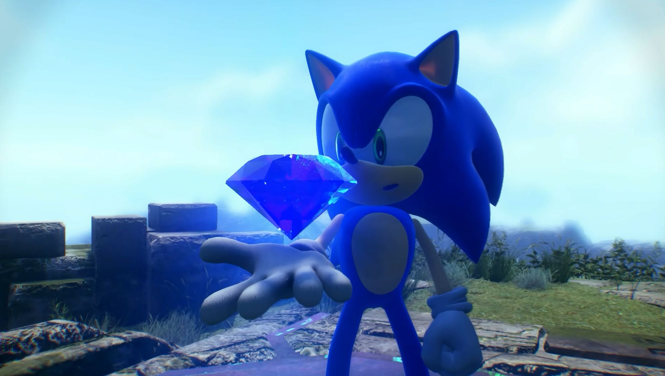
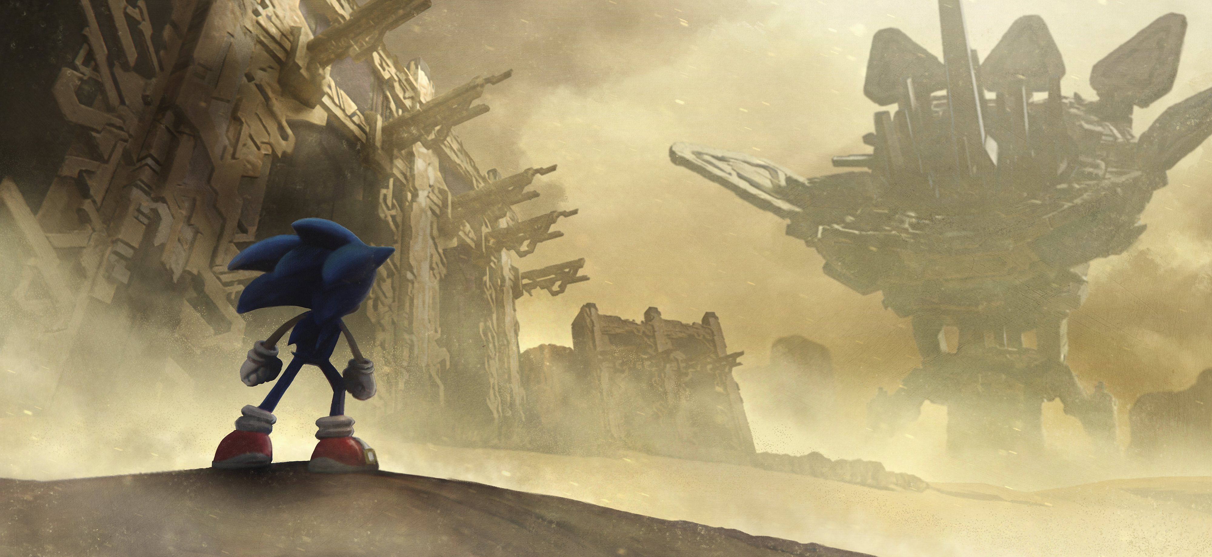
Playing Frontiers over the last few days both on Steam Deck and on a high-spec PC rocking an Nvidia RTX 4090, I absolutely understand why Sega pulled the classic protectionist PR move of telling VG247 it didn’t have any early review code left for the game even though we knew colleagues had enjoyed access to the game for a good week. It’s natural PR stuff: look at the outlet, look at who might be reviewing, and if you anticipate that you might get a kicking maybe quietly not send them the game. Or, at least, delay sending it. In the end, Sega slipped us a Nintendo Switch code a few hours before the embargo lifted. Fair enough. Tom had his own list of issues with the Switch version which were largely about how that version of the game is optimized (or, indeed, not optimized) - but the truth is, Sonic Frontiers is beset with a million-and-one issues even on a top-spec PC. But you know what? It… sort of doesn’t really matter? The game itself is… fun? Good? Engaging? Addictive? Add your own cliched gaming buzz word of choice here. Here’s the thing about Frontiers: it sort of feels like the best proof-of-concept demo in the world? Or one of the best, anyway. The heart of the game, its flow and feel, is tremendous. Its eerily empty Death Stranding-esque open world actually serves a brilliant purpose, in that its wide and sparse nature means that, for once in the 3D era, there is room for Sonic to run at top speed in a free-form fashion. There’s been Sonic fan games that have played with this concept in the past, but the Sega-developed games have always either focused on highly choreographed high-speed stages that reward twitch reaction and muscle memory, or by slowing the blue blur down, usually by lumbering him with rubbish friends or silly maladies. Frontiers has none of that. You can tool around the world, and at its best simply travelling around completing dumb little puzzles and fighting the odd enemy feels a bit like running through a tightly-designed Tony Hawk’s Pro Skater level – weird comparison, I know. While the open world looks pretty empty at first glance, there’s little triggers and activities everywhere. Many of these activities aren’t that compelling, but Frontiers is sort of the definition of a game that’s more than the sum of its parts in that sense. So compelling is the open world, in fact, that the more traditional ‘Boost’ stages (presented here as ‘Cyberspace’ levels that are to some degree recycled from other games) are sort of an afterthought, a distraction. In other recent Sonic games, these were the single best bit of the game. Not so here. So what is it that makes Frontiers feel like a tech demo? Well, just look at it. I’m not talking about graphics here, either (they aren’t great, but the game does have to load geometry fast as Sonic zips around, so I forgive it). I’m talking about these weirdly realistic looking world biomes, populated by more fantastical enemies and Sonic and friends. None of these biomes really matter, either – they just feel like skin swaps. What’s a pile of leaves in verdant green zones will be swapped for little sand dunes in the desert. And much of the level geometry that you interact with is identical across every biome anyway. So you take this relatively consistent desert zone, for instance, and populate it with grind rails and metal platforms, direction-changing shooter devices, springs, and all manner of other things. These elements are fairly natural to Sonic, who has his roots in recreating the feel of pinball, but in most of his past outings these things were rooted in a world design and logic. Here, they’re just sort of spat into the world, used in identical ways in every biome. There’s no attempt to, say, justify a grind rail in a desert level as vines or wood. That’s something even Sonic Adventure 2 did. The metal rails just spawn into the world and ethereally float in mid-air. I think this is why Frontiers so often looked a bit pants in pre-release screenshots - you look at Sonic overlooking an open world and just see a bunch of crap floating off in the distance. Contextualizing the platforming fun is important, but here there’s none of that. It almost feels as though the developers legitimately thought it a complete waste of time. This is driven home hard by those cyberspace levels, too, since they have that colorful world that is zany but nevertheless has logic. In the main game, you’re in dour, flat biomes with little internal logic. But it sure looks cool when you zip around those random-looking springs and rails, I guess. Then you end up back on the ground, look up, and it just looks dumb as hell. This is the thing that really undermines the game for me, in fact. I can take clipping through the world to fall to my death, or physics breakdowns that kill your momentum at random or force poor Sonic to go flying skywards. I can even take how the lock-on feels wildly inconsistent, and the aggressive pop-in even on a PC powerful enough to melt a man’s face off. Most of this is because what the game presents is so compelling in a raw gameplay sense. The way the world looks baffles me, though. It looks unfinished – like they dropped in rails and springs in order to set up a satisfying layout, planned to build logical geometry around those traversal elements, and then just… forgot. A part of Sonic has always been taking the rough with the smooth: you don’t deserve Sonic at his Star Light Zone if you can’t also accept him at his Labyrinth Zone, after all. There’s no Emerald Coast without 10 bloody Emerald Hunt levels, I guess. But Frontiers takes this mantra to extremes. The good is so good, and the bad is… so bad. This gives fuel to the overall feeling I have on the game, which surprises me as much as anyone: it feels like Sonic Team has finally cracked it. For the first time since Sonic Adventure, I really do feel like there’s an exciting and invigorating vision for what a modern, 3D Sonic the Hedgehog game could play like. It works. I’m satisfied by it. I have no intention of putting it down. But, at the same time, what’s presented in Frontiers feels like a first attempt at these ideas. It feels like there’s the kernel of a truly great game here. What we get instead are great ideas offered up with extremely middling execution. It’s one step forward, two steps back. But I feel more positive about Sonic than I have in years (Mania aside). I look forward to a sequel that runs with what they’ve built here. In the meantime, consider Sonic Frontiers recommended – if you’ve got the patience to deal with its foibles.


